

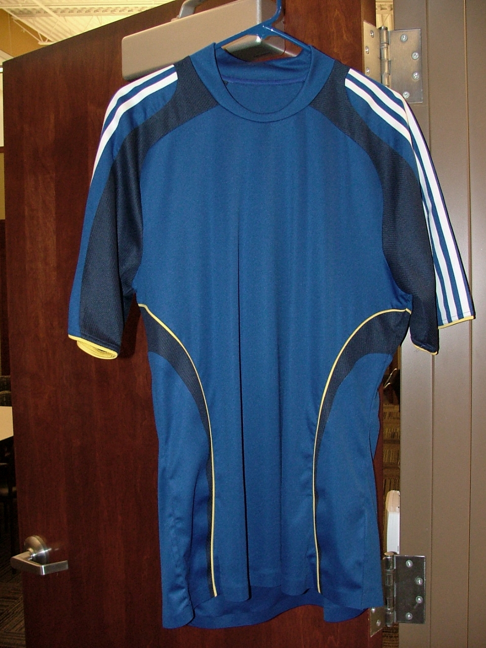
Finally after much talk of what the 2008 Wizards Jersey will look like I have a picture of it. The jersey is the actual jersey with the lettering and logo missing. This picture was taken during a tour of the Wizards training facility Friday evening a video of that tour will be posted on Monday. So what do you think of our new jersey? More pictures inside.
You can click on any of the photos to see a bigger version.

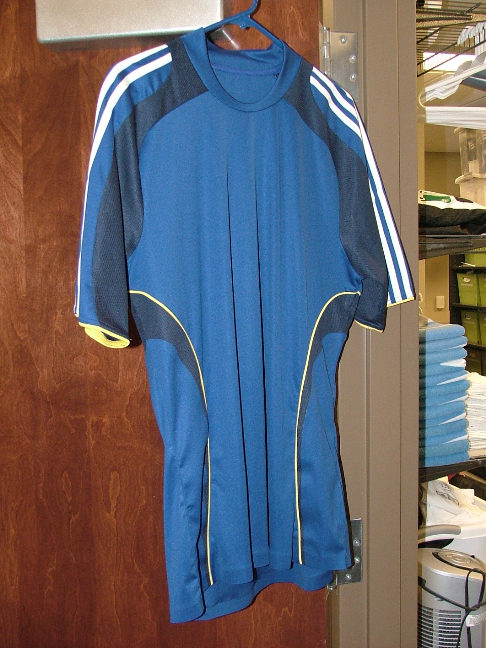
There are a few more photos located here
Filed under: Feature, Jersey, News, Off the field info |

I must say I like it much more than I expected I would given the information about it.
Phenomenal camera work!
I think it’s excellent. Great combo of colors. Cool style. Good choice by the Wizards.
are you sure youre allowed to see that?
I’ll have to reserve my judgment of the shirt until i can see how it would look with logos, sponsor?/Kansas City, name, and etc.
Yech. Most of that is adidas’ fault since I think the template is to blame, but still. I loved the simplicity of last year’s shirt (not to mention the shade of blue) and I hate the random-side-panel/two-tone approach.
On the other hand, this is better than what the Revs are doing with the same template.
LA called, they want their shirts back.
wow, they let you take a pic.
Oh man, wizardscharter is gonna go apeshit over the black on the jersey
I am not sure what to think of it. It looks decent.
Don’t like it.
Huh?
Are you colorblind?
As far as I can see, I don’t believe there isn’t any black anywhere on the jersey.
A little bit disappointing as it is a bit too dark IMHO.
But I also would like to see how it looks with the numbers, wordmarks, logo, etc….
i take it back, it’s not black I guess, it’s Navy Blue.
jimmy is going to throw up. a boycott on purchasing this jersey should be put in place for this disaster.
what balck on the jersey? that looks like navy. and i don’t think it looks like the galaxy jersey that much at all. the galaxy wear navy. this looks like a dark-royal blue.
i want to see the full kit before i decide. I’m leaning toward liking it, though.
What black? That’s navy.
I’m thinking adding some mock red bullet hole dots to prepare the players for Bannister might be nice…. 🙂
We all might want to reserve judgement until seeing it in the flesh.
It is different. Once it has our sponsor or name and the logo on it you may get a better feel for it. Right now without those aspects it simply doesn’t look like our jersey. Perhaps someone with wicked Photoshop skills could now do a mock up with those elements on it. If so sent it in and I’ll post that as well.
navy and yellow, where have I seen this before? Oh yeah. LA…
LA’s is all navy with yellow on the piping and on the sleeve stripes. This is royal blue with navy accents, white stripes and a little bit of yellow piping. It looks totally different.
doesn’t LA’s have a collar too? This doesn’t.
it’s about the design of the shirt that makes it like LA’s, it’s the color scheme. it’s utter crap.
that was supposed to say, “it’s NOT about the design…”
It needs to have #23 on it, doesn’t it?
I’m curious to see the full uniform, with shorts/socks. It’ll look sharp.
The addition of yellow seems out of place. The style is good though.
Will they run faster wearing these things? Who cares as long as they don’t look like the old rainbow shirts.
I want to see Blanco wear this shirt, and do the famed Blanco move. Then they would be cool.
I’d rather they be wearing the rainbow again rather then this jersey that looks way too much LA.
Bring back Wizards Blue!!!
Are you guys honest to god kansas city fans? I thought you were a myth, like the loch ness monster. One of you posted this on a washington post soccer blog-the esteemed steven goff. I don’t have the words to express how little I care about the design of the new kansas city jersey. Please keep your sorrow to yourself.
You like us “Who Cares” don’t you? I can tell.
but the color scheme doesn’t even look like LA’s. LA’s main color is navy. This is clearly not navy.
Obviously it looks close enough to LA’s to make people compare the two. The whole blue and yellow layout is way too similar for my tasting, especially with the secondary blue that is navy.
wow, it’s a self absorbed DC fan you guys are a dime a dozen. Get over yourselves already.
I personally would have preferred they went to a lighter blue, but apart from my own ideal I really like this jersey. I’ll be buying one.
Alright, now that I have seen both the New England and Kansas City kits I can say that it is no longer about the respective franchises making a poor decision and is completely the fault of Adidas for making a god-awful template.
I am not a great fan of the other new template (used for many of the national sides and San Jose) they released this year, but it is a far cry better than this drap, disgusting fare. It looks like a horrid training shirt–as I said about the New England kit–from the early 90’s. It has almost now design continuity; it looks like a designer drunkenly fit together pieces of fabric on the last day before deadline and anxiously submitted to the finalizing team.
This rivals the awful looking offerings from Lotto and Admiral, which no self-respecting professional club should even consider, much less don. One half of MLS teams will look somewhat respectable, while to other half look like pub league contenders.
If I’m honest I’ll still buy one, but I hate the thing. Even when I picture it nicer, with Kansas City across the chest and our logo on there I hate it. I really really really hate it. While everything OnGoal has done for the team has been great this choice makes me feel betrayed.
I love the color blue we have used, like many others have said it was unique to the Wizards in MLS. Let’s be honest we are in the midwest, we are not New York, Boston, LA. Those teams can have drab colors and still get noticed. We need to be unique we need something fun and this navy blue is no where near unique. I hate it so much, I’m in deep as a fan, but I don’t think I would have been as interested in the team if they had always been this drab blue. Please say it isn’t so, please give us Wizards Blue back.
If this was to get feedback, here it is. It is horrendous. You’ve spit in the face of your loyal fans and have done so with a choice that will not help you gain new ones. If it is not too late please change it. PLEASE!
I really don’t know… the yellow trim actually doesn’t look that bad, but I do agree it looks kinda like LA’s jerseys. I think I’ll wait to see what it looks like WITH logos before I say much, but I don’t mind the two tone so much. (Although it does take you back to the horrid jerseys of WC 2002. Ugh.) In any case, I’ll cheer for the Wizards no matter what they wear, but I’ll need to be quite a bit richer before I go fork out some money for this.
Eh. Too Dark, wont show well on TV for sure. Our Bright Blues looked great on TV night or day. And all those sick flags whoever made…they dont match. Id say if you dont like it, dont buy one and maybe they will switch it back. Our traditional Blue really stood out. Maybe it’s just a test or trick to test the reaction. We do this all the time for my day job so don’t freak out.
PS: Dark Blue is a difficult color to print for other uses. Depending on the printing setup, it can look either purple or black. Brighter Blues are easier to match across different printing techniques and platforms. If you are printing merch, brighter blues always work better than dark ones.
Eh.
m.
Nevermind, the first photo is just too dark, the new ones look fine.
DOH! Im allover this for the fantasy logo fiend that lives in my head.
Tight. I like the stripe too.
M.
Where is the KC Blue! Very disappointing and UGLY!! No new jersey purchase for me this season.
Here is link to the other photos of it.
Guys, relax. It’s just a jersey.
The ire of the faithful is always raised when there is a change. Such is the case now.
It’s the team I support, the jersey is secondary. After this year, no one will care.
Alright, I’m relaxed now…….
Lets just throw HERBALIFE on this bad boy and call it a day!
[IMG]http://i68.photobucket.com/albums/i39/msodapotter/navyandblue.jpg[/IMG]
Cool if someone could do that with our old and new
Even if we do use this jersey for gameday. Wizards Till I Die Baby!!!
Is it March yet?!
The new jerseys look horrible. I’m sorry.
It’s not that different.
It is a pretty poor template, but templates come and go. What disappoints me is the absence of Wizards blue. The club settled on a great and unique (in MLS) color scheme after the end of the rainbow era. Looking at this kit, I don’t even know what the new color scheme is. Will navy blue be a fixture on jerseys for years to come, or is it just part of the template? Will the shoulder stripes stay white while KC only chooses templates that have accent piping? Would somebody just tell me which colors are my club’s colors? Right now, I have no clue.
The last photo is the only one using a flash.
This uproar is ridiculous! The Jersey is fine. It’ll probably change ever couple of years, that’s the way it goes these days.
Come on, the old Wizard blue color was more or less gay.
I kinda like the “jersey” – Sure, I wish there was more Wizard Blue and less of that dark blue . . . but like most of us posting, I will buy one. As far as the template goes, sure it looks like the Galaxy’s, but then – at least to my eyes – didn’t last year’s jerseys look a whole lot like any given high school or college jersey?
[…] 2008 KC Wizards Jersey with Picture [image] Finally after much talk of what the 2008 Wizards Jersey will look like I have a picture of it. The jersey is […] […]
it’s fine as far as a jersey goes – nothing spectacular, just OK. That said, it’s my club and I’ll probably buy it. And in two years when we completely rebrand, I will buy that shirt, too.
all they really need to do is get rid of the navy…I mean, look at liverpool’s home shirt…it’s pretty much stayed consistent and hasn’t been changed just because adidas makes a new template.
get rid of the navy, change the yellow to white and there’s nothing wrong with that shirt.
JD, you’re ridiculous. you’re still going to buy something even though you hate it… i mean, “really, really, really hate it?” sheep.
[…] sources on the internet (which sounds like an oxymoron, but still…) claim this is the what the Kansas City Wizards will be wearing for the MLS […]
So when are they going to announce Sprint as the sponsor….before the beginning of the season so that there will be only one jersey to buy–with the sponsor logo on it? Might as well make it totally completely ugly instead of just plain ugly.
I love the yellow accent. Don’t know why exactly, just looks great. Not a fan of the navy though. Get rid of the navy and its awesome. However, I still can’t wait to buy one at my first Wizards game this year.
[…] over at OzCity has pictures of the new KC Wizards kit for the 2008 Major League Soccer season. The shirt is without the team badge or any sponsor logo or […]
this is worthless i do not like it at all bring back the light blues
[…] Kansas City Wizards Home Jersey. As you can see it is closer to “Wizards Blue” than our photo of the prototype first showed. I love it! What do you think? Buying one? Official Press Release explaining the […]